DESIGN FOR STAR LIFE, I'LL FOLLOW THE PUN
in General February 15, 2024
The writer and director Alfred Hitchcock was quoted as saying… “Puns are the highest form of literature”. As such, you can never underestimate the power of a pun to engage your audience.
Blondes have more pun, and as a fair-haired lover of wordplay, me and the STAR Project have always been a good match. Colleagues said I was ‘Born to Pun’ in my previous job. Thankfully, STAR Project and I are also playful, fearless and creative with the promotional copy in our mission to engage audiences. Historically, puns are acknowledged in advertising and marketing as a friendly, humorous and accessible way to convey information. Like STAR, I’ll always follow the pun.
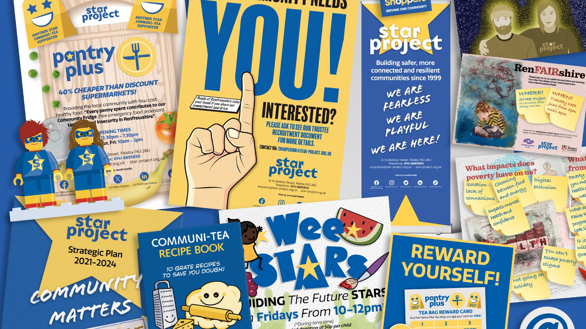
With my experience in graphic design and photography, I’m constantly looking at ways to improve STAR’s visual communications. I will always advocate for consistent colour branding throughout STAR’s print and social media platforms to create uniformity and familiarity with the target audience. Being aware of colours, fonts, and logo choices can successfully get your information over to an audience as quickly as possible. Knowing which words or graphics to highlight in blue, yellow or white to focus people’s attention on the main points will aid our print or social media message. Intelligent use of colour and design enables you to stand out in a crowded market that’s vying for people’s attention. This is one reason why copy and design are valued tools to help communicate what’s on offer and increase engagement in the service.
My primary role at STAR is working in our busy Pantry Plus community food provision service. A heavily subsidised food service we established based on our learning over lockdown, which engenders resilience and tackles the stigma of food insecurity. The way it’s presented is not a million miles away from the world of design and photography. First impressions are as important as how it’s promoted online and in print. We create a friendly atmosphere that encourages people to repeatedly engage with the service. Our welcome is always genuine and heartfelt; we know our community would see through anything less.
When tasked with creating a brand identity for Pantry Plus, I was conscious that the look should retain an instant visual link to the STAR ethos. Consequently, one glance at the branding and people should immediately think of STAR Project. We are small but always aim big with our graphic and verbal communications. Hopefully, the design and feel created for our service highlights the WE ARE FEARLESS, WE ARE PLAYFUL, WE ARE HERE for what people need.
Like many of the team at STAR, I began working with the organisation as a volunteer, using my design and photography skills to promote the service. After supporting the community throughout lockdown, I became a more regular fixture when I became a member of the staff team. Being at the Project every day means I get to spend time with the real STARs of the show – the community. I look forward to greeting and serving many more new and existing community members in 2024.
Remember, if you think of any good STAR-related puns, I’m all ears!
By Willie Kay